Variables | |
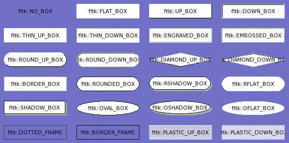
| Box *const | fltk::BORDER_BOX |
| Box *const | fltk::BORDER_FRAME |
| Box *const | fltk::DIAMOND_DOWN_BOX |
| Box *const | fltk::DIAMOND_UP_BOX |
| Box *const | fltk::DOTTED_FRAME |
| Box *const | fltk::DOWN_BOX |
| Box *const | fltk::EMBOSSED_BOX |
| Box *const | fltk::ENGRAVED_BOX |
| Box *const | fltk::FLAT_BOX |
| Box *const | fltk::HIGHLIGHT_DOWN_BOX |
| Box *const | fltk::HIGHLIGHT_UP_BOX |
| Box *const | fltk::NO_BOX |
| Box *const | fltk::OFLAT_BOX |
| Box *const | fltk::OSHADOW_BOX |
| Box *const | fltk::OVAL_BOX |
| Box *const | fltk::PLASTIC_DOWN_BOX |
| Box *const | fltk::PLASTIC_UP_BOX |
| Box *const | fltk::RFLAT_BOX |
| Box *const | fltk::ROUND_DOWN_BOX |
| Box *const | fltk::ROUND_UP_BOX |
| Box *const | fltk::ROUNDED_BOX |
| Box *const | fltk::RSHADOW_BOX |
| Box *const | fltk::THIN_DOWN_BOX |
| Box *const | fltk::THIN_UP_BOX |
| Box *const | fltk::UP_BOX |
|
|
Diamond shape used to draw Motif-style checkboxes. |
|
|
Raised diamond shape used to draw Motif-style checkboxes. |
|
|
Ellipse with a black border. |
|
|
Ellipse with a black border and gray shadow. |
|
|
Ellipse with no border. |
|
|
Pushed in version of PLASTIC_UP_BOX |
|
|
Box designed to vaguely resemble a certain fruit-themed operating system. |
|
|
Inset oval or circle. |
|
|
Raised oval or circle. |
|
|
Round-cornered rectangle with a black border. |
|
|
Round-cornered rectangle with a black border and gray shadow. |
|
|
Round-cornered rectangle with no border. |
|
|
Default value for focusbox(). This draws nothing if FOCUSED is not set in the flags. If it is set, this draws a dashed line one pixel inset. |
|
|
Draws nothing. Can be used as a box to make the background of a widget invisible. Also some widgets check specifically for this and change their behavior or drawing methods. |
|
|
Draws a flat rectangle of getbgcolor(). |
|
|
Inset box in fltk's standard theme |
|
|
A up button in fltk's standard theme. |
|
|
1-pixel-thick inset box. |
|
|
1-pixel-thick raised box. |
|
|
2-pixel thick engraved line around edge. |
|
|
2-pixel thick raised line around edge. |
|
|
1-pixel thick gray line around rectangle. |
|
|
Obsolete. Draws colored edge and draws nothing inside rectangle. |
|
|
Draws like FLAT_BOX normally, and as THIN_UP_BOX when the mouse pointer points at it or the value of the widget is turned on. |
|
|
Draws like FLAT_BOX normally, and as THIN_DOWN_BOX when the mouse pointer points at it or the value of the widget is turned on. |
 ©2004 Bill Spitzak and others. See Main Page
for details.
©2004 Bill Spitzak and others. See Main Page
for details.