Public Member Functions | |
| int | handle (int) |
| TabGroup (int, int, int, int, const char *=0, bool begin=false) | |
| int | value () const |
| bool | value (int) |
| int | which (int event_x, int event_y) |
| Widget * | selected_child () |
| bool | selected_child (Widget *) |
| void | set_draw_outline (bool draw_outline) |
| void | pager (TabGroupPager *value) |
| TabGroupPager * | pager () const |
| int | tab_height () |
| int | tab_positions (int *, int *) |
| void | draw_tab (int x1, int x2, int W, int H, Widget *o, int sel=0) |
| void | draw_tab_background () |
Static Public Member Functions | |
| void | default_pager (TabGroupPager *v) |
| void | default_pager (int factory_pager_index) |
Static Public Attributes | |
| NamedStyle * | default_style |
Protected Member Functions | |
| void | draw () |
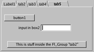
Each child widget is a card, and it's label() is printed on the card tab (including the label font and style). The color() of the child is used to color the tab as well.
The size of the tabs is controlled by the bounding box of the children (there should be some space between the children and the edge of this widget). If there is a larger gap on the bottom than the top, the tabs are placed "inverted" along the bottom. It is easiest to lay this out in fluid, using the fluid browser to select each child group and resize them until the tabs look the way you want them to.
Clicking the tab makes that child visible() and hides all the other children. If the widget with the focus does not consume them, the ctrl+tab and ctrl+shift+tab keys will also switch tabs. The user can also navigate the focus to the tabs and change them with the arrow keys.
The callback() of the TabGroup widget is called when the user changes the visible tab, and SHOW and HIDE events are passed to the children.
|
||||||||||||||||||||||||||||
|
Creates a new TabGroup widget using the given position, size, and label string. Use add(widget) to add each child. Each child is probably an Group widget containing the actual widgets the user sees. The children should be sized to stay away from the top or bottom edge of the |
|
|
setting the default pager_ from the built-in ones
|
|
|
setting the default pager_ for future tabgroups, a default pager is _never_ null by design
|
|
|
returning the current pager_ responsible of this instance
|
|
|
setting the pager_ to a tabgroup, pager is _never_ null by design assign dynamically a new pager with a preconfigured prototype |
|
|
Switch to this child widget, or to a child that contains() this widget. Returns true if this is a different selection than before. Does not do the callback(). If the widget is null or not a descendent of this, the last child is selected. |
|
|
Return child(value()), or return null if no children. |
|
|
Switch so index n is selected. If n is less than zero selects zero, if n is greater than the children it selects the last one. Returns true if this is a different child than last time. Does not do the callback(). |
|
|
Return the index of the first visible() child, which is normally the one the user selected. This will automatically force a single child to be visible() if more than one is, or if none are. If more than one is visible all except the first is hidden. If none are, the last one is made visible. The resulting visible child's index is returned. This behavior allows new TabGroups to be created with all children visible, and allows children to be deleted, moved to other groups, and show()/hide() called on them without the display ever looking wrong to the user. If there are no children then -1 is returned. |
|
||||||||||||
|
Return the child index that would be selected by a click at the given mouse position. Returns -1 if the mouse position is not in a tab. |
|
|
The default style has a gray color() and the box() is set to THIN_UP_BOX. The box() is used to draw the edge around the cards, including the top edge, but the tab itself is designed only to match THIN_UP_BOX. You can also use FLAT_BOX and it will look correct if the tabs fill the entire width of a window or parent box. Reimplemented from Widget. |
 ©2006 Bill Spitzak and others.