Inherited by FillSlider, Scrollbar, and ValueSlider.
Public Types | |
| enum | { LINEAR, TICK_ABOVE, TICK_LEFT, TICK_BELOW, TICK_RIGHT, TICK_BOTH, LOG } |
Public Member Functions | |
| bool | horizontal () const |
| bool | log () const |
| void | draw () |
| int | handle (int) |
| Slider (int x, int y, int w, int h, const char *l=0) | |
| unsigned short | slider_size () const |
| void | slider_size (int n) |
| unsigned short | tick_size () const |
| void | tick_size (int n) |
| int | slider_position (double value, int w) |
| double | position_value (int x, int w) |
| int | handle (int event, const Rectangle &) |
| void | draw_ticks (const Rectangle &, int min_spacing) |
| bool | draw (const Rectangle &, Flags flags, bool slot) |
Static Public Attributes | |
| NamedStyle * | default_style |
See Valuator for how to set or get the value or handle callbacks when the value changes.
The appearance of the base class may be changed in several ways:
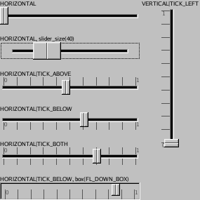
Setting the box() to any value other than the default of FLAT_BOX, as shown in the example on the bottom-left, will remove the "slot" and draw a box around the slider and the tick marks. The color() (which defaults to GRAY75) is used to fill in the area behind the slider and tick marks.
You can use set_vertical() to make the slider move up/down rather than horizontally.
The following bits may be or'd together and given to type():
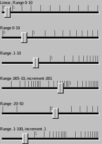
The tick marks are placed the slider_size() or more apart (they are also no closer than the step() value). The color of the tick marks is controlled by textcolor(), and the font used to draw the numbers is textfont() and textsize() (which defaults to 8).
You can change the glyph() function to change how the moving part is drawn. The drawflags() determines what part of the slider is being drawn. The ScrollBar subclass turns on ALIGN_TOP/LEFT/RIGHT/BOTTOM to draw the buttons at the end (this is the same as Widget::default_glyph() takes and the default slider glyph just calls that). The moving part has bit 16 turned on, unless this is a fill slider in which case bit 16 is off. You can check the LAYOUT_VERTICAL flag to see which direction the slider is going in.
|
||||||||||||||||
|
Subclasses can use this to redraw the moving part. Draw everything that is inside the box, such as the tick marks, the moving slider, and the "slot". The slot only drawn if slot is true. You should already have drawn the background of the slider. |
|
||||||||||||
|
Draw tick marks. These lines cross the passed rectangle perpendicular to the slider direction. In the direction parallel to the slider direction the box should have the same size as the area the slider moves in. |
|
||||||||||||
|
This call is provied so subclasses can draw the moving part inside an arbitrary rectangle. |
|
||||||||||||
|
This is used by subclasses to handle events correctly: Return the value if the left/top edge of a box of slider_size() is placed at X pixels from the edge of an area of size w pixels. The range() and log() settings are taken into account, and it also rounds the value to multiples of step(), using powers of 10 larger and multiples of 2 or 5 to get the steps close to 1 pixel so the user is presented with nice numerical values. |
|
||||||||||||
|
This is used by subclasses to draw the slider correctly. Return the location of the left/top edge of a box of slider_size() would be if the slider is set to value and can move in an area of w pixels. The range() and log() settings are taken into account. |
|
|
Set the dimensions of the moving piece of slider. This is measured in pixels in a direction parallel to the slider's movement. The default value is 12. Setting slider_size() to zero will make the slider into a "fill" slider that draws a solid bar from the left/bottom to the current value. This is useful for indicating progress or as a output indicator. |
|
|
The slider is shrunk this many pixels from the widget's width so that the tick marks are visible next to it. The default value is 4. |
 ©2006 Bill Spitzak and others.