| | [ Return to Bugs & Features | Post Text | Post File | SVN ⇄ GIT | Prev | Next ]
STR #2951
| Application: | FLTK Library |
|---|
| Status: | 5 - New |
|---|
| Priority: | 1 - Request for Enhancement, e.g. asking for a feature |
|---|
| Scope: | 3 - Applies to all machines and operating systems |
|---|
| Subsystem: | Core Library |
|---|
| Summary: | DoubleSlider for selecting low and high values within min/max range |
|---|
| Version: | 1.4-feature |
|---|
| Created By: | engelsman |
|---|
| Assigned To: | Unassigned |
|---|
| Fix Version: | Unassigned |
|---|
| Update Notification: | |
|---|
Trouble Report Files:
[ Post File ]
Trouble Report Comments:
[ Post Text ]
| |
| #1 | engelsman
05:57 Apr 14, 2013 |
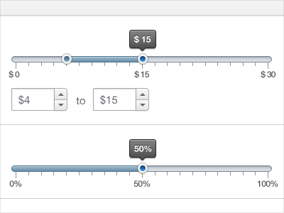
| I have an application with a colour bar type legend which does not give
the required resolution, so I needed to be able to adjust the low and
high values in an intuitive but minimally invasive way on screen.
I hacked together the following demonstrator, drawing some inspiration
from Fl_Slider. The features I required were:
- a vertical slider
- possibility of setting min and max values of continuous range (no step)
- possibility to move low and high sliders (min <= low < high <= max)
I then hacked it further to fit directly with the rest of my application.
Questions:
1. Does anybody know of a similar widget out there?
2. Is it worth factoring out a separate DoubleValuator base class?
3. Apart from vertical/horizontal what other features are needed?
4. Does it require min/low/high/max fields?
5. Would a floating tooltip with feedback be enough? (eg Greg's TipWin)
I'd be willing to have a go a this, but can't provide any timeframes. | |
| |
| #2 | engelsman
06:06 Apr 14, 2013 |
| Oh, I forgot to say:
I needed to align the slider with an existing widget, which is itself
pretty idiosynchratic, so added the top and bottom members to allow
adjusting the alignment after the other had resized itself.
Thinking about it afterwards, it would have been better to correct the
existing idiosynchratic widget, and rely on the Fl_Box boundary for any
alignment. So the top/bottom stuff will likely be removed.
D | |
| |
| #3 | greg.ercolano
13:36 Apr 14, 2013 |
| Can't say regarding [1] or [2].
For [3], I'd say google for "double slider widget" and "range slider"
and see what you can gather in the way of options. And maybe check out
those widget's API to see if they have anything clever.
I guess such things can be used for everything from temperature to
date ranges. For the latter, it sounds like a app-provided callback
could be used to convert numeric values to/from strings such as dates.
Options I noticed from doing the above google searches:
> a graticule option
> drawing an optional box between the tabs
> ability to drag the above box (to move both tabs locked together)
> option to show text fields above and below the tabs
> options for text fields to be editable
> options for text fields to include up/down arrows
> options for text fields to be integer vs. float
> support Fl::scheme("gtk+") (and possibly "plastic")
> arrow shaped "tabs" instead of raised rectangles (tinypic link below)
> option to show high/low values above or to side of slider
at all times (instead of as a tooltip),eg:
http://content.w3avenue.com/2009/components/jquery-ui-slider-from-select-element/cover.jpg
> data string callback (or virtual method) that lets the app
convert numeric values to app defined strings (such as
int<->date conversion)
Also: this little 'gif video' is neat; a bit over the top with
features, but it shows the 'dragging tab lock' mentioned above:
http://www.slicer.org/slicerWiki/images/6/6b/VolumesModuleWindowLevelSliderPopup.gif
Also:
http://dribbble.s3.amazonaws.com/users/58823/screenshots/303390/slider.png
http://i48.tinypic.com/2ebsn5i.jpg
Regarding [4], yes, I think a min/max for the entire range would be
needed, unless you wanted it to be a fixed 0.0 to 1.0 range slider,
which might simplify the API, but makes the user's job harder.
(Seems the widget should try to support values the app would want,
including ints, floats, and perhaps even strings as described above)
Of course doing all the above is probably too much, but perhaps it'll
give some idea as to how to design the widget so that such features
could be provided by the app by its overloading the widget. | |
| |
| #4 | greg.ercolano
13:41 Apr 14, 2013 |
| Oh, and for [5], I think tooltips would be good for some but not all
cases.. text fields that are always visible would probably be needed
very much as well.. perhaps an option for one or the other or both.
Definitely try to plan so the user can override things like draw()
and perhaps being responsive to FL_WHEN_CHANGED (so the callback is
called during dragging) or on FL_WHEN_RELEASE (only called back when
the user is done moving a tab)
If you have an option for drawing a box between the tabs, I guess
plan it so that the box is reactive to Fl::scheme("gtk+") or "plastic"
so that the box drawing style inherits e.g. gradient behavior.. perhaps
even the tabs themselves, and the widget's "trough".. | |
| |
| #5 | greg.ercolano
13:49 Apr 14, 2013 |
| Oops, and responsive to keyboard navigation. This means:
o responding to FL_FOCUS to handle drawing the focus box
(or not based on focus visibility)
o possibly allowing the two tabs to be keyboard selectable
via Tab and Shift-Tab
o responding to the arrow keys to let the user alter the
tab positions (perhaps the arrow key step value to be
selectable in the widget's API),
o Perhaps even a separate step rate for Ctrl-Arrows
o Probably respond to left/right arrow for horiz slider
or up/down arrow for vert slider
Perhaps some of the arrow behavior comes for free if you derive
from FLTK's existing valuator widgets. | |
| |
| #6 | greg.ercolano
14:02 Apr 14, 2013 |
| ..and don't forget to take into account handling deactivation,
affecting how the widget draws itself, etc.
It occurs to me maybe I should write an article or make a video or
something on how to make an FLTK widget, all the wacky details and
implications. I wish I had one when I was writing Fl_Tree and Fl_Table,
as there's a lot of stuff about keyboard nav and when() that I didn't
know about until much later.. making it hard to go back and retrofit..! | |
| |
| #7 | AlbrechtS
02:36 Apr 15, 2013 |
| Well, Greg said it all.. ;-)
That said, here's one addition from me. It'd be good to have the widget look like the other FLTK slider widgets for integration with other sliders. However, I'd also like it to have its own fancy look. Maybe both (selectable) would be good to have. (The ultimate option would be to provide a hook to enable own draw() functions, but that's probably too much effort.)
So I think that making this DoubleSlider widget being able to use only one slider would be simple and offer an opportunity to use it (and its maybe different look) as a normal slider widget as well, depending on an option or flag - need not be its own class name. | |
| |
| #8 | AlbrechtS
08:14 Feb 08, 2019 |
| Duncan, is there any progress on your side? Do you still pursue this idea at all? | |
| |
| #9 | engelsman
10:07 Feb 08, 2019 |
| I want to thank you and Greg for a very interesting discussion and pointers, but NO, after hacking together the minimum that I needed, the need went away and never had any chance to pursue it further.
So, after six years of my inactivity on both this widget idea and FLTK, I think you can safely close this STR. | |
| |
| #10 | AlbrechtS
06:24 Feb 09, 2019 |
| Hi Duncan, thank you for the quick reply and all your contributions to FLTK!
I unassigned this STR but I'm not going to close it.
Maybe someone else might pick up the idea (IMHO useful as a new widget) and since we put lots of info here this should not get lost.
Thanks. | |
[ Return to Bugs & Features | Post Text | Post File ]
|
| |
")