fltk::CheckButton Class Reference
Inherits fltk::Button.
Inherited by fltk::LightButton, and fltk::RadioButton.
Public Member Functions | |
| CheckButton (int x, int y, int w, int h, const char *l=0) | |
| virtual void | draw () |
Static Public Attributes | |
| static NamedStyle * | default_style = &::style |
Detailed Description
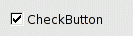
This button turns the value() on and off each release of a click inside of it, and displays a checkmark to show the user this:
You can control the color of the checkbox with color() and the color of the checkmark with textcolor(). You can make it draw different colors when turned on by setting selection_color() and selection_textcolor() on the widget (these are ignored if set in an inherited style()).
Constructor & Destructor Documentation
| CheckButton::CheckButton | ( | int | x, |
| int | y, | ||
| int | w, | ||
| int | h, | ||
| const char * | l = 0 |
||
| ) |
The constructor handballs creation to Button(), sets type(TOGGLE) and sets ALIGN_LEFT|ALIGN_INSIDE on the label
- Parameters:
-
x The x position of the CheckButton, relative to the group y The y position of the CheckButton, relative to the group w The width of the CheckButton h The height of the CheckButton l The CheckButton's label
Member Function Documentation
| void CheckButton::draw | ( | void | ) | [virtual] |
Handballs drawing onto Button::draw(), with a glyph width of textsize()+2
Reimplemented from fltk::Button.
Member Data Documentation
NamedStyle * CheckButton::default_style = &::style [static] |
The default style for a CheckButton reverts to NO_BOX and a default glyph (the check mark to the left)
Reimplemented from fltk::Button.
Reimplemented in fltk::LightButton, and fltk::RadioButton.
The documentation for this class was generated from the following files:
- fltk/CheckButton.h
- src/CheckButton.cxx
