Human Interface Guidelines
")
|
Last Updated 13 Nov 2024 ContentsIntroductionThis document describes guidelines for FLTK-based user-interfaces which are used by the FLTK developers for the widgets and applications that ship with FLTK. Since FLTK is a cross-platform toolkit, the layout and design guidelines described here may conflict with those recommended by your favorite vendor or environment. We have chosen common elements from the CDE/Motif, GNOME, KDE, macOS, and Windows environments to promote consistency and simplicity across platforms. Note: the links below have been updated to current versions on Nov 13, 2024. The current status of these linked documents may or may not correspond to the information given below. The following list of documents should serve as an introduction to the various user-interface guidelines for each platform, along with some recommended reading for user-interface design:
The following list of UI guidelines can be found from multiple sources and was compiled from a survey of people that do user interfaces - Google for references. The order is from most useful to least useful guideline:
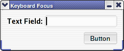
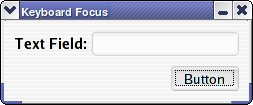
User InputUser input is supplied using the mouse and keyboard in FLTK. FLTK provides visual cues indicating which widget will receive keyboard input. Shortcuts (special key sequences) can be used to activate a widget or function. Mouse ButtonsMost mice have 1 to 3 buttons; in some cases, the second button may also have a wheel that is used for scrolling. For the purposes of discussion, we will assume a right-handed mouse where button 1 is the leftmost button, button 2 is the middle button, and button 3 is the rightmost button. Since all Apple computers come with a 1 button mouse and many users do not know how to use a multi-button mouse, all programs should be usable with a 1 button mouse. The left button is used to click on buttons, set the insertion point in text fields, drag text and/or objects, and select text and/or objects. Double-clicking the left button typically activates or selects text and/or objects under the mouse pointer. The middle button is typically used as a substitute for double-clicking button 1 and (in text fields) to paste selected text at the mouse pointer position. The latter can be system specific, particularly on Unix like systems. The right button is typically used to display a context-sensitive menu for the control underneath the mouse pointer. On macOS, the right button is simulated by holding the Ctrl key down and clicking the left button. Mouse WheelThe mouse wheel is used for scrolling. Normally, the mouse wheel will scroll whatever control is underneath the mouse pointer. Moving the wheel forward scrolls up, backward scrolls down, and (if so equipped) left/right movement scrolls in the corresponding direction. Keyboard Focus CuesFLTK has visible focus cues that show which widget will receive keystrokes by default. For text controls, a cursor is shown inside the control. For non-text controls, a dotted border is drawn inside the edge of the control:
Keyboard ShortcutsKeyboard shortcuts are typically combinations of one or more modifier keys with a letter or number. Special keys such as Enter, Return, and Escape are often used by themselves to activate functions in an application or window. The following is a list of standard keyboard shortcuts that should never be used for other functions; FL_COMMAND is mapped to the clover (command) key on macOS and the Ctrl key on other platforms:
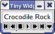
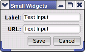
Controls (Widgets)Widgets are the user interface controls that the user interacts with to perform some task. FLTK provides a rich set of widgets which are illustrated in the following sections. ButtonsText FieldsValuatorsListsMenusScrollingLayout and DesignGood layout and design of user interfaces can take time, planning, and research, however the following guidelines can be used to simplify the process. In addition, FLUID offers guide lines based on these layout rules which makes it easy to design user interfaces that conform. SizingFLTK controls should (consistently) use one of three standard sizes - tiny, small, and normal - as summarized by the following table:
SpacingTiny widgets should be positioned with no space between them and the edge of the window:
Small widgets should be positioned with 0 or 5 pixels between them and 5 pixels from the edge of the window:
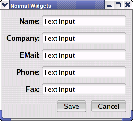
Normal widgets should be positioned with 0 or 10 pixels between them and 10 pixels from the edge of the window.
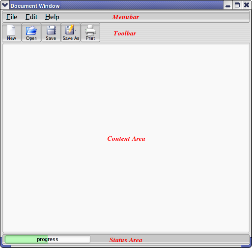
WindowsWindows are part of every GUI application and can generally be placed in one of three categories: document, tool, dialog. Document WindowsDocument windows, sometimes called application windows, are used as the main interface for an application. Traditionally, document windows have a menubar at the top, a toolbar below the menubar, a content area in the middle, and a status area at the bottom:
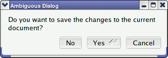
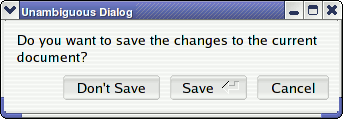
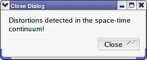
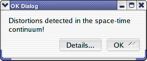
Tool WindowsTool windows provide a palette of buttons and/or options for mode-based user interfaces. For example, an image painting application might have a tool window with selection and drawing tools. Clicking on a tool button selects that mode in the application. Dialog WindowsDialog windows are used to receive (input) or display (output) information. They are temporary windows, usually modal, and have one or more buttons at the bottom of the window. Dialog windows should not have a menubar - those are for document windows. In almost all cases, an input dialog window will have a "Cancel" button along with one or more action buttons. The action buttons should be labeled with unambiguous verbs or phrases indicating their actions and not generic words like "Yes", "No", and "OK". The general rule of thumb is this: if you can remove everything from the window except the buttons and still have a meaningful dialog, then you have the right labels on your buttons:
Output dialogs typically display a single paragraph or sentence and have a single button labeled "OK" which dismisses the dialog. When displaying potentially complex information, an additional "Details" button is provided to expand the dialog or display a new dialog with the detailed information. "Close" buttons should not be used in output dialogs since "close" is a verb and is used in input dialogs:
|
Comments are owned by the poster. All other content is copyright 1998-2026 by Bill Spitzak and others. This project is hosted by The FLTK Team. Please report site problems to 'erco@seriss.com'.