Table of Contents
The Widget Properties Panel
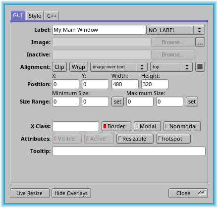
This panel is used to edit the properties of the currently selected widgets. It can be opened by double-clicking on a widget or by pressing F1.
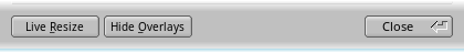
When you change attributes using this panel, the changes are reflected immediately in the window. It is useful to hit the "Hide Overlays" button (or type Ctrl+Shift+O) to hide the red overlay so you can see the widgets more accurately, especially when setting the box type.
One or more widgets can be selected at the same time, and most attribute changes will be applied to the entire selection. Depending on the selected widget types, some properties may be grayed out or may not be visible.
All changes in the widget panel are immediately applied to all selected widgets and their effect can be seen in the project window. It can be very useful to keep the Code View window open at all times. All code changes appear instantly for all generated files if Auto-Refresh is active.
FLUID generates only code for properties that differ from their default setting. If a widget class is derived from another class, FLUID can't know the defaults and will generate code for all attributes instead.
Correctly resizing a window can be a complex task. It is easier to check resizing behavior on a more local level first. To use Live Resize, select any group or window in your project. FLUID creates a resizable clone of that part of your design to try out resizing behavior of that group only.
The widget panel itself is resizable to make more room for entering code and long texts.
The GUI Tab
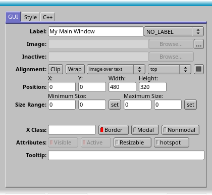
The widget panel has three standard tabs that apply to all widgets. Some widget types, Fl_Grid and children of Fl_Grid, will create additional tabs with more options.
The GUI tab controls basic GUI settings, including label text and widget size.
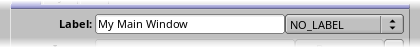
The Label field can be any Unicode string and is stored as a static text. If internationalization is enabled, the corresponding modifiers are added. Labels can span multiple lines by pressing Ctrl-J to insert a newline (NL) character.
The @ character adds a symbol to the label. See Labels and Label Types in the FLTK documentation.
The pulldown menu offers some additional rendering styles for the label.
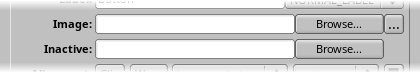
Add an image to the widget label here. The second row takes an optional image for rendering a deactivated widget.
The image path must be relative to the location of the .fl file and not necessarily the current directory. It is helpful to keep images in the same directory as the .fl file.
The image data is inlined into the source code. If many widgets share the same image then only one copy is written. Since the image data is embedded in the generated source code, you need only distribute the C++ code and not the image files themselves. The .fl project files however store only the image file name, so you will need the image files as well to read a project file.
FLUID can read XBM bitmap files, XPM pixmaps with a transparency channel, and all other types supported by the FLTK image extension. Images can be stored in their original file format, or converted into their uncompressed rgb or grayscale pixel data, with or without alpha channel. By default, image files ending in .jpg, .png, .svg, and .svgz are stored as they are. All other formats are converted to pixel data. The storage format can be manually selected in the "convert to raw pixel data" checkbox in the image properties dialog.
Images stored in their original format are usually compressed well and take a lot less space, but they also require that the fltk-image library and all its dependencies are linked to the application. Storing uncompressed pixel data increases the size of the application, but has less dependencies and saves time when launching because images don;t need to be decompressed. As a good rule of thumb, keeping the original format is good for images larger than 24x24 pixels and when the application links to the fltk-image anyway. An app that has only a hand full of small icons may be better off storing raw pixel data and not link with fltk-image.
The image properties dialog provides Scale settings to scale the image before rendering to screen. To make full use of high-dpi screen support, images should be stored at double resolution and then scaled to FLTK coordinates. This gives FLTK the chance to fall back to the full size image for high-dpi screens.
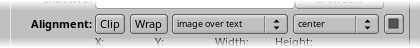
Control alignment of the label in relation to the widget position and size as well as the relation between the image and the label. The box on the right toggles between inside and outside label alignment.
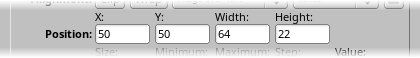
Control the size and position of a widget here. The input fields react to vertical scroll wheel input for interactive positioning.
All fields understand basic math. They are evaluated after the formula is entered and the result is stored in the respective properties. Formulas can also contain a number of variables. The x input can handle the variables x for its own position, px for the parent position, sx for the previous sibling, cx for the leftmost x position of all children, and i, which is a counter through all selected widgets.
The formula x+10 in the x field moves all selected widgets 10 pixels to the right. 100+25*i in the y field arranges all widgets vertically starting at 100 with 25 pixels distance.
| Name | Value |
|---|---|
i | zero based counter of selected widgets |
x, y, w, h | position and size of the current widget |
px, py, pw, ph | dimensions of the parent widget |
sx, sy, sw, sh | dimensions of the previous sibling |
cx, cy, cw, ch | bounding box of all children |
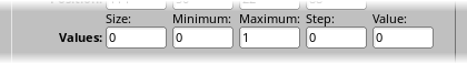
Activate for widgets that can take numerical values, these input fields take floating point numbers. They generate lines like o->minimum(2); only if the corresponding value differs from the default value for this property.
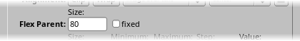
This row is only visible for children of Fl_Flex widgets. It sets the width or height of a widget in a horizontal or vertical Flex widget. If fixed is unchecked, this value is instead calculated by the Flex.
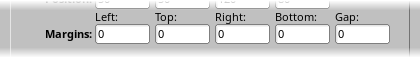
This row is only visible for Fl_Flex widgets. It sets the various margins and the gap value for this widget.
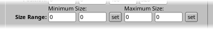
This row is only visible for top level windows. The fields set the minimum and maximum size range for windows. Use the set button to copy the current size. Set width and height to 0 to disable that aspect of the size range.
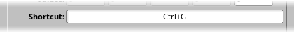
This option is only visible for buttons and other widgets that can react to a shortcut key combination. FLUID does not check if a shortcut was already used elsewhere.
If shortcut use FL_COMMAND is set in the project settings, modifiers are created in a more compatible way across platforms.
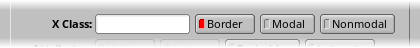
This row is only visible for top level windows. Note that selecting modal and non modal together is undefined.
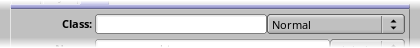
The string typed into the X Class field is passed to the X window manager as the class. This can change the icon or window decorations. On most window managers you will have to close the window and reopen it at runtime to see the effect.
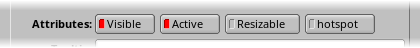
Some additional attributes for all widget types.
The Visible button controls whether the widget is visible (on) or hidden (off) initially. Don't change this for windows or for the immediate children of a Tabs group.
The Active button controls whether the widget is activated (on) or deactivated (off) initially. Most widgets appear grayed out when deactivated.
The Resizable button controls whether the window or widget is resizable. In addition all the size changes of a window or group will go "into" the resizable child. If you have a large data display surrounded by buttons, you probably want that data area to be resizable. You can get more complex behavior by making invisible boxes the resizable widget, or by using hierarchies of groups. Resizing of a window or group can be tested using the live resize button.
Note that the Resizable indicator is ambiguous when a window is selected. Making a window resizable will resize all children proportionally. Setting a child of a window will make that child the center of the resize operation. In both cases, the Resizable indicator of the window will be set.
The Hotspot button causes the parent window to be positioned with that widget centered on the mouse. This position is determined when the FLUID function is called, so you should call it immediately before showing the window. If you want the window to hide and then reappear at a new position, you should have your program set the hotspot itself just before show().
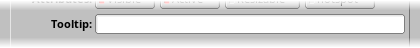
The Tooltip field can be any Unicode string and is stored as a static text. If internationalization is enabled, the corresponding modifiers are added.
The Style Tab
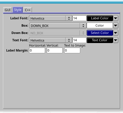
The Style tab is used to edit font styles and sizes, and the color of elements of the widget.
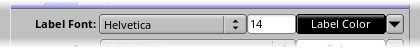
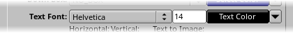
The font pulldown menu provides a list of standard fonts. To enter the index of a user loaded font, an extra code field must be used. The label color and text color fields opens a color palette selector. The arrow pulldown contains a list of the most commonly used colors. Again, user specific colors can be defined using the extra code field.
The Text Font row is only available for widgets that contain an additional text area.
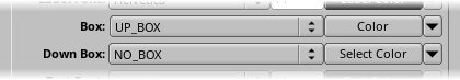
Select the up and down box for the given widget. The first six entries in the box and frame style list are influenced by the FLTK Scheme setting. Other box styles will always look the same, independently of the selected scheme.
Many widgets will work, and draw faster, with a "frame" instead of a "box". A frame does not draw the colored interior, leaving whatever was already there visible. Be careful, as FLUID may draw this ok but the real program may leave unwanted stuff inside the widget.
If a window is filled with child widgets, you can speed up redrawing by changing the window's box type to "NO_BOX". FLUID will display a checkerboard for any areas that are not colored in by boxes. Note that this checkerboard is not drawn by the resulting program. Instead random garbage will be displayed.
The Down Box row is only available for widgets that can be pressed down by the user.
Some widgets will use the Select Color for certain parts. FLUID does not always show the result of this: this is the color buttons draw in when pushed down, and the color of input fields when they have the focus.
The C++ Tab
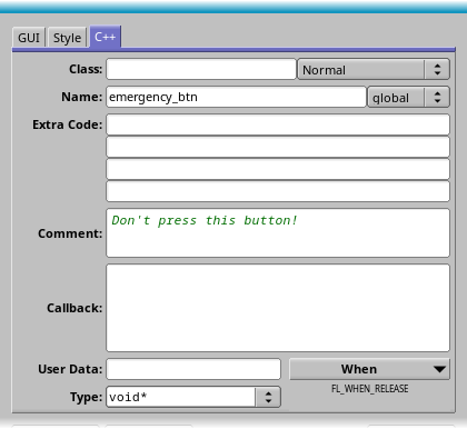
The C++ tab has various input fields for adding C++ code at various places in the source and header file.
If the class property is set, FLUID assumes that the user wants to instantiate a widget that is derived from the selected widget. For a derived widget, the default values of attribute can not be known. FLUID will generate code to explicitly set every known attribute of the super class.
FLUID generates "include" statements for known classes. Custom classes should provide a #include line as one of the "Extra Code" lines of the widget.
If the selected widget is a Widget Class node, the Class property will instead set the super class of the widget.
The pulldown menu on the right side contains additional subtypes for some widget types. Fl_Button widgets, for instance, can be further refined to be an Fl_Toggle_Button or an Fl_Radio_Button.
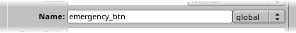
The name field can be any valid C++ variable name. If the widget is inside a class, the pulldown menu lets the user select between private, protected, and public. If not in the group, the variable can be global or static within the source file.
Widgets created by FLUID are either "named", "complex named" or "unnamed". A named widget has a legal C++ variable identifier as its name (i.e. only alphanumeric and underscore). In this case FLUID defines a global variable or class member that will point at the widget after the function defining it is called. A complex named object has punctuation such as '.' or '->' or any other symbols in its name. In this case FLUID does not attempt to declare it. This can be used to get the widgets into structures. An unnamed widget has a blank name and no pointer is stored.
You can name several widgets with "name[0]", "name[1]", "name[2]", etc.. This will cause FLUID to declare an array of pointers. The array is big enough that the highest number found can be stored. All widgets in the array must be the same type.
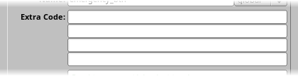
These four input fields can be used to add arbitrary code to different parts of the header and source file. A line can be divided into multiple lines of code by inserting a Ctrl-J.
All Extra Code fields are interpreted individually. If a field contains a # character, or the words extern, typedef, or using, FLUID assumes that the code is a declaration and writes it to the header file, and only if it does not duplicate previously written code. This is great for creating a #include "MyWidgetType.H" include statement in the header.
If the code is not recognized as a declaration, it will instead be put after the code that instantiates the widget and all its children. For menu items, the code is added after the container Fl_Menu_ is created, but before the menu array is added to the container.
FLUID will check for matching parentheses, braces, and quotes, but does not do much other error checking. Be careful here, as it may be hard to figure out what widget is producing an error in the compiler. If you need more than four lines you probably should call a function in your own .cxx code.
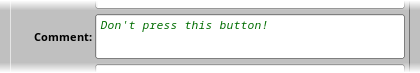
Comments are added to the source code before the widget constructor by adding // in front of every line of the comment. The first few characters of a comment are also visible in the widget browser in the main window.
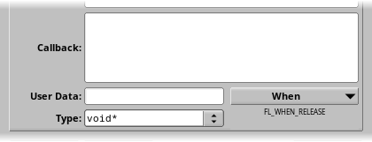
The callback field can be interpreted in two ways. If the callback text is only a single word, FLUID assumes that this is the name of an external callback function and declares it in the header as extern void my_button_action(Fl_Button*, void*);.
Otherwise, FLUID assumes that the text is the body of a C++ callback function and instead creates a local static callback function. The name of the callback function is generated by FLUID and guaranteed to be unique within the file.
You can refer to the widget as o and the user_data() as v. FLUID will check for matching parentheses, braces, and quotes, but does not do much other error checking.
If the callback is blank then no callback is set.
The User Data field can contain any valid C++ code and is copied as the callback argument. If blank the default value of zero is used. Type* is currently limited to a pointer (a type name ending in *) or long.
The When pulldown gives access to the Fl_When flags, including some commonly used combinations.
The Grid Tab
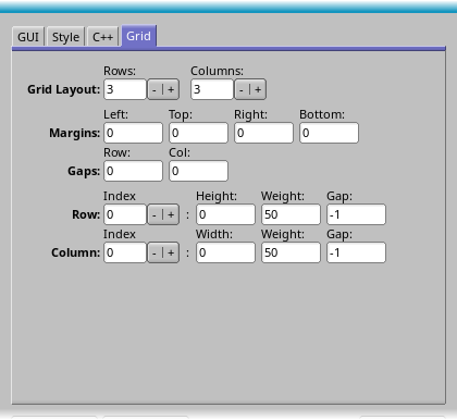
This tab is only available if the selected widget is an Fl_Grid. When editing a Grid widget, no other widgets should be selected.
The Grid Layout fields adjust the number of rows and columns in the grid.
The Margins fields describe the size of the margins around all children of the grid.
The Gaps fields set the gaps between individual children in the grid.
The Row and Column groups can be used to set the size of individual rows and columns within the grid.
The Grid Child Tab
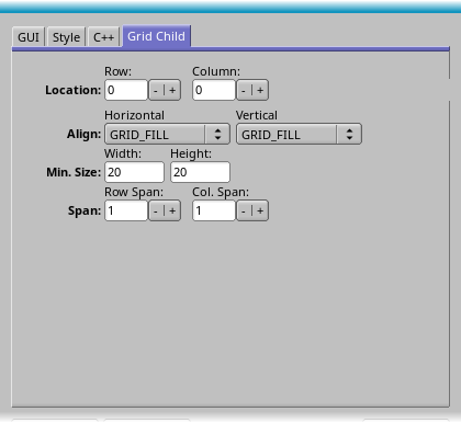
This tab is only available if the selected widget is a child of an Fl_Grid. When editing a child of a Grid widget, no other widgets should be selected.
Use the Location group to move a child around within the grid. Note that every cell in a grid can only manage one single widget. When moving widgets over occupied cells, they become "transient". Just continue and move them into an available cell. If a layout is saved with a transient widget, all grid attributes for that widget are lost, and it will remain unassigned in the project file and in the source code.
The Align fields provide a way to align a widget within its cell.
The Min. Size fields define a minimum width and height for the widget in the cell.
The Span fields change the number of cells that a widget can span in x and y.
- Note
- Most attributes in this tab will also change the size of the widget. If the child of the Grid is itself a group, the children of that group do not follow changes in position or size. It is recommended to either lay out the grid contents first and leave it unchanged, or to use widgets generated with Widget Class that automatically adjust themselves to the size constraints of the grid.